
Fall, 2020
Due: Dec 1 by 11:55 pm (London ON time)
import numpy as np
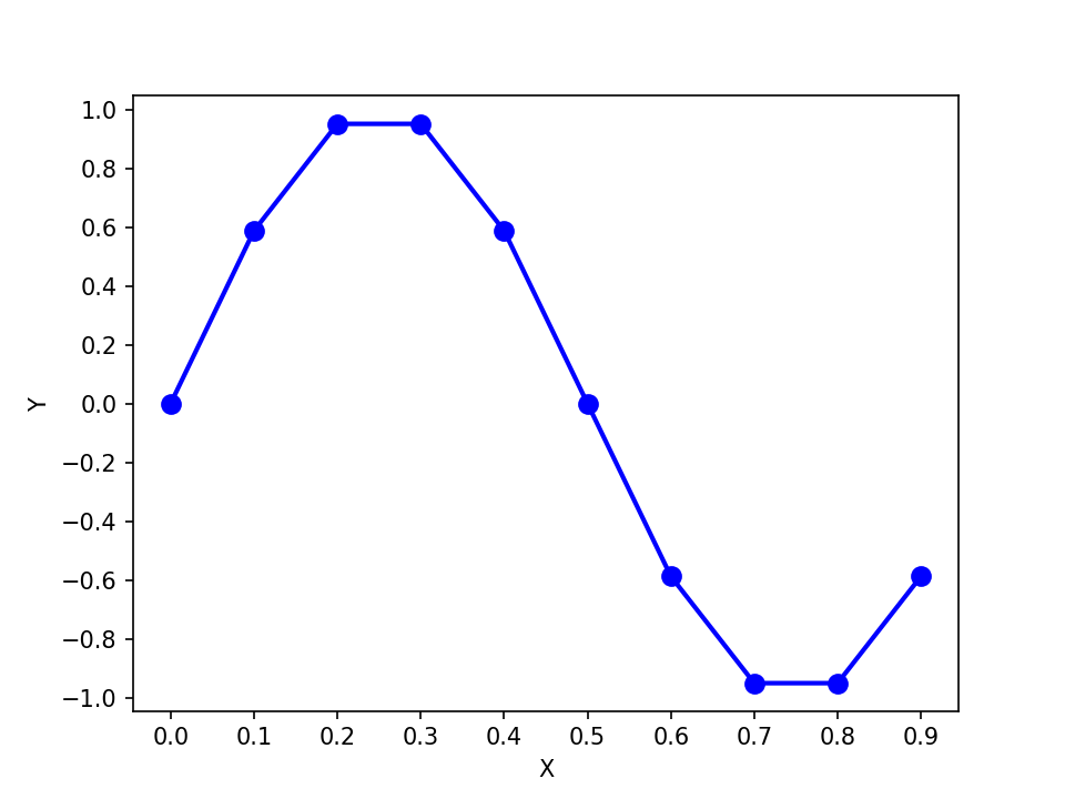
import matplotlib.pyplot as pltDefine a 1D array x containing 10 values starting at 0, ending at 0.9, in increments of 0.1. Define a vector y that is equal to \(\sin(2*\pi*x)\). Generate a line plot with x on the horizontal axis and y on the vertical axis. Use blue circles at each data point (markersize of 8.0), connected by blue solid lines, with a linewidth of 2.0. Label the horizontal axis “X” and the vertical axis “Y”. Set the range on the horizontal axis so it goes from 0 to 0.9 in steps of 0.1, and on the vertical axis so it goes from -1 to 1 in steps of 0.2.
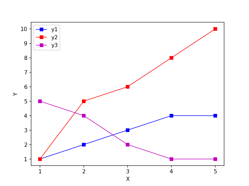
Define a 1D array x [1,2,3,4,5]. Define a 1D array y1 [1,2,3,4,4], y2 [1,5,6,8,10], and y3 [5,4,2,1,1]. Generate a multi-line plot using squares (markersize 6.0) connected with solid lines (linewidth 1.0). Label the axes as shown, and set axis limits and axis ticks as shown. Add a legend as shown. The y1 colour is blue, the y2 colour is red, and the y3 colour is magenta.
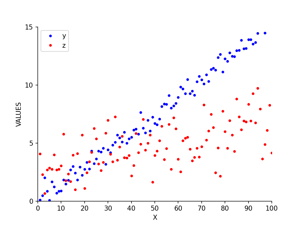
Define a 100-length 1D array x starting at 1 and ending at 100 in increments of 1. Define y equal to (x * 0.15) + N where N is a 100 element 1D array of random values chosen from a gaussian distribution with mean 0.0 and standard deviation 0.5. Let z be equal to ((x * 0.05) + 2) + N2 where N2 is a 100 element 1D array of random values chosen from a gaussian distribution with mean 0.0 and standard deviation 2.0. Generate a scatterplot as shown below, using filled circles (markersize 3.0). The y colour is blue and the z colour is red. Pay attention to the axis labels, tick marks, and ranges.
Re-plot the data from Question 3 using subplots, as shown below. Be sure to replicate the axis limits, and axis labeling. Use boldface font to add a title to each subplot (A, B, and C, aligned to the left of each subplot as shown below).
Hint: adjust the hspace parameter for subplots so that the subplots don’t overlap:
plt.subplots_adjust(hspace=0.6)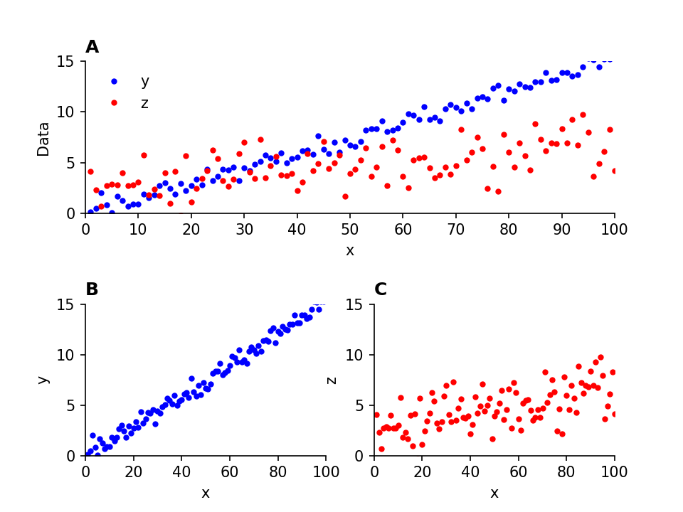
Do your best to replicate all of the elements of the Figure. Note that the data values may look different if your random number generator produced different random values. That’s OK.
Hint: ax.spines["top"].set_visible(False) will turn off the top part of the box outlining each plot