Data wrangling & visualization I — ggplot2
Week 2
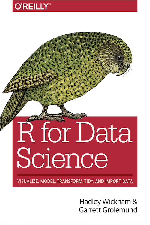
R/RStudio books
- R for Data Science
by Hadley Wickham & Garrett Grolemund

- ggplot2: Elegant Graphics for Data Analysis
by Hadley Wickham
Data Visualization
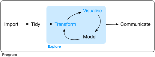
- this week: we will learn the basic structure of a ggplot2 plot
Data Transformation
- next week: we will learn the key verbs (R commands) to:
- select variables
- filter out observations
- create new variables
- compute summaries
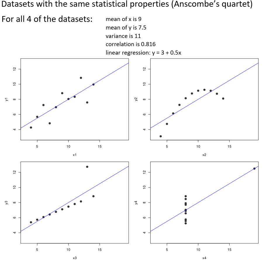
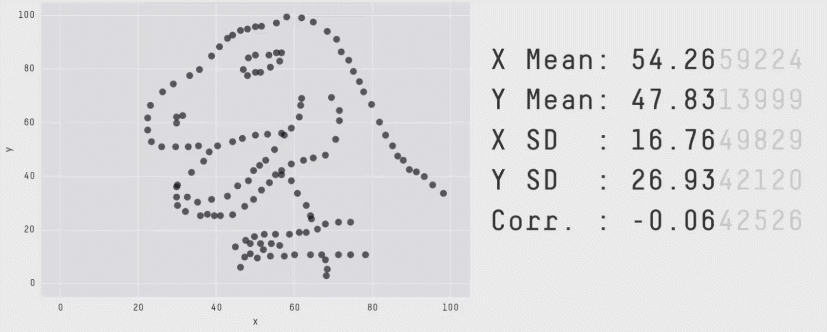
Why make plots?
- numeric summaries of data are easy to generate
- mean, sd, correlation, list of t-tests, etc…
- but numerical summaries are just summaries
- they can obscure patterns in the underlying data
Anscombe’s Quartet
Datasaurus Dozen
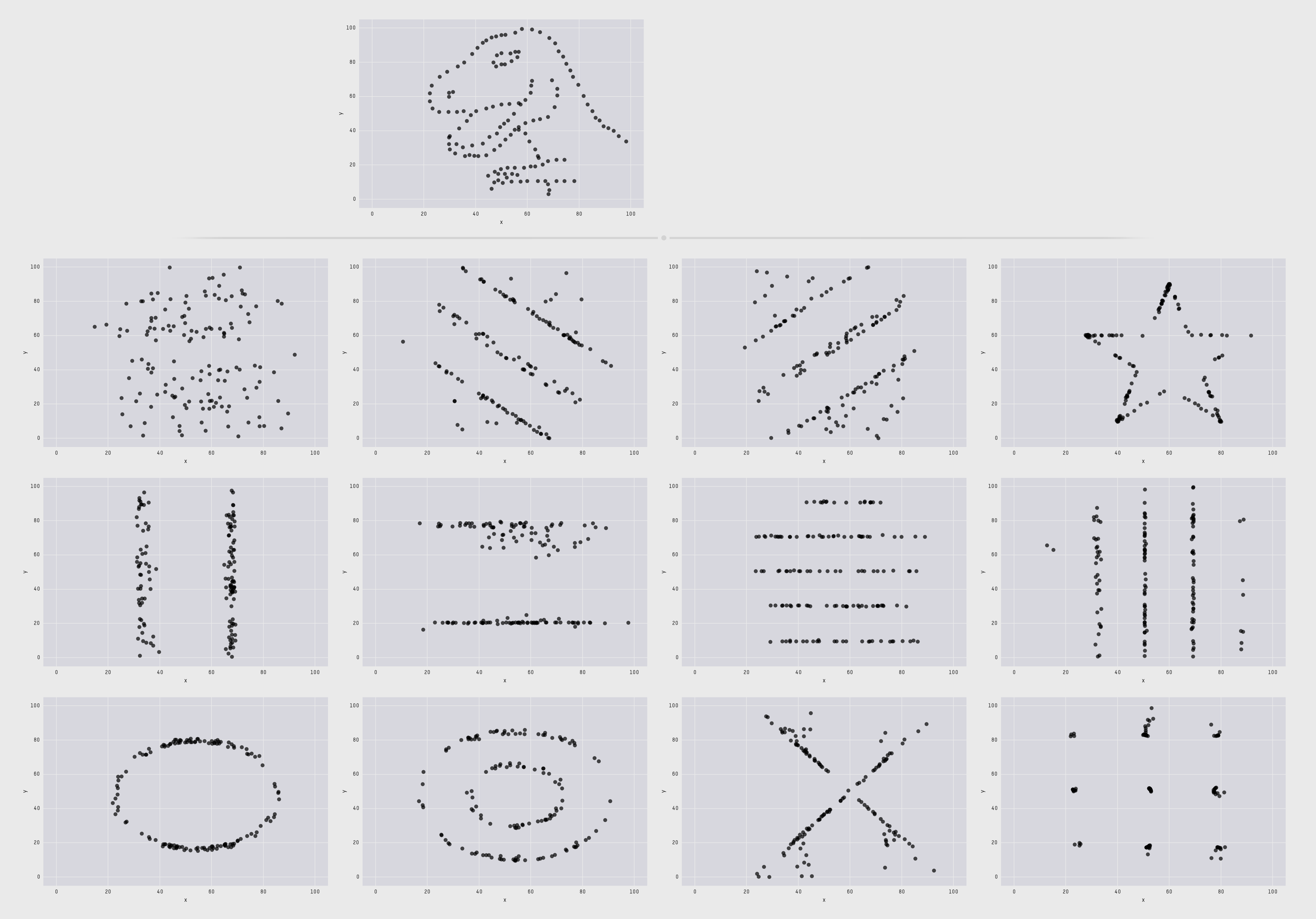
Datasaurus Dozen
. 
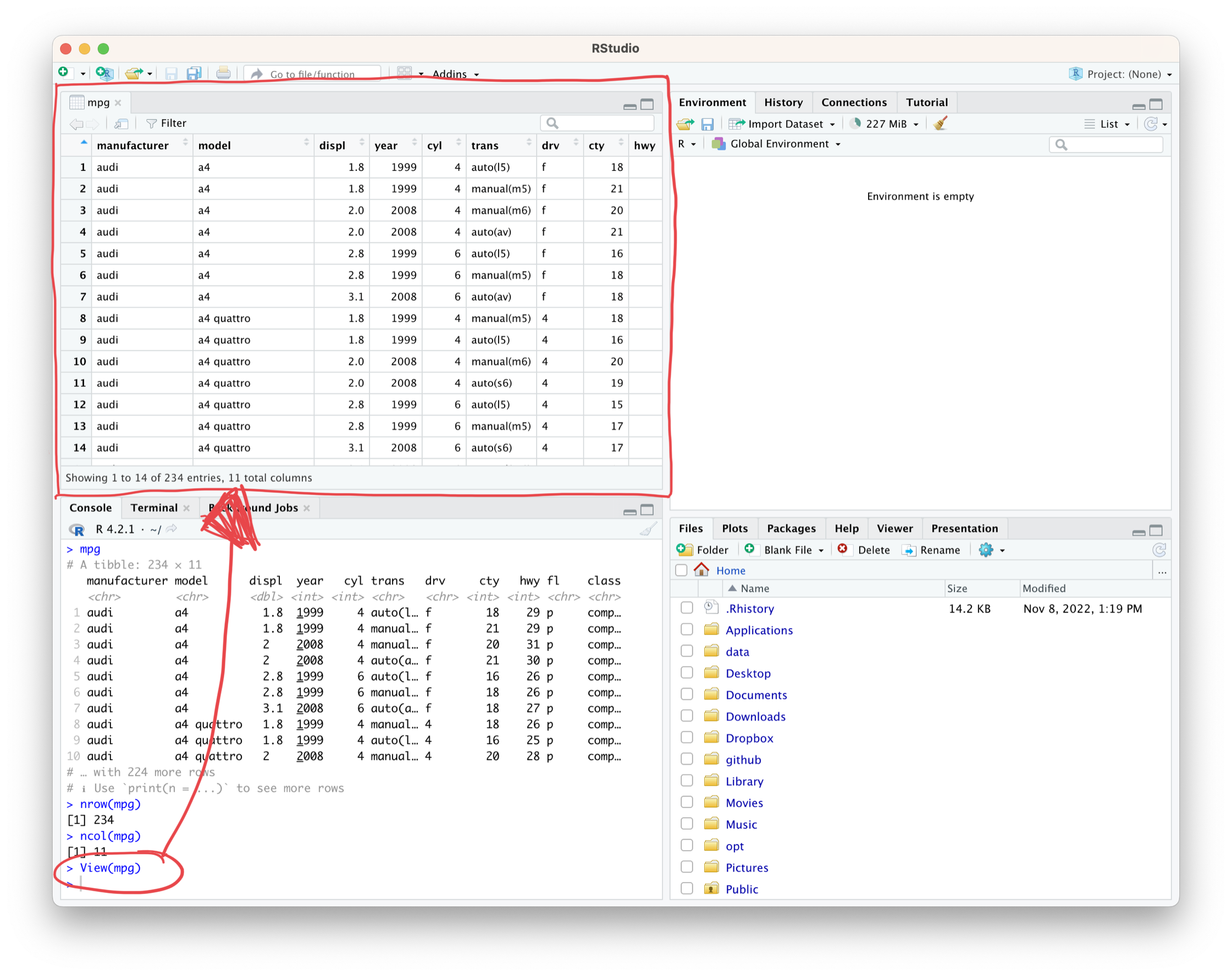
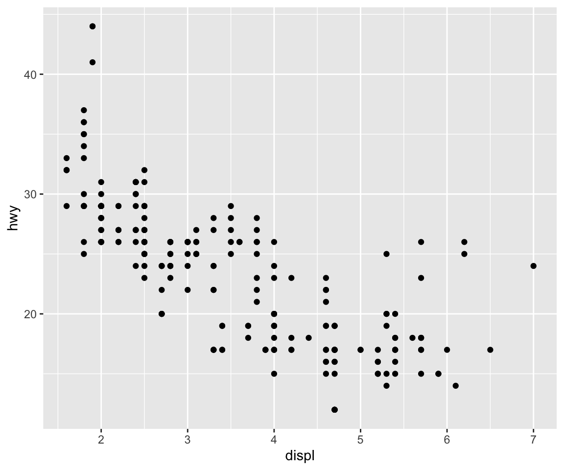
Sample dataset: mpg
- type
View(mpg)to bring up a spreadsheet-like view of the data frame
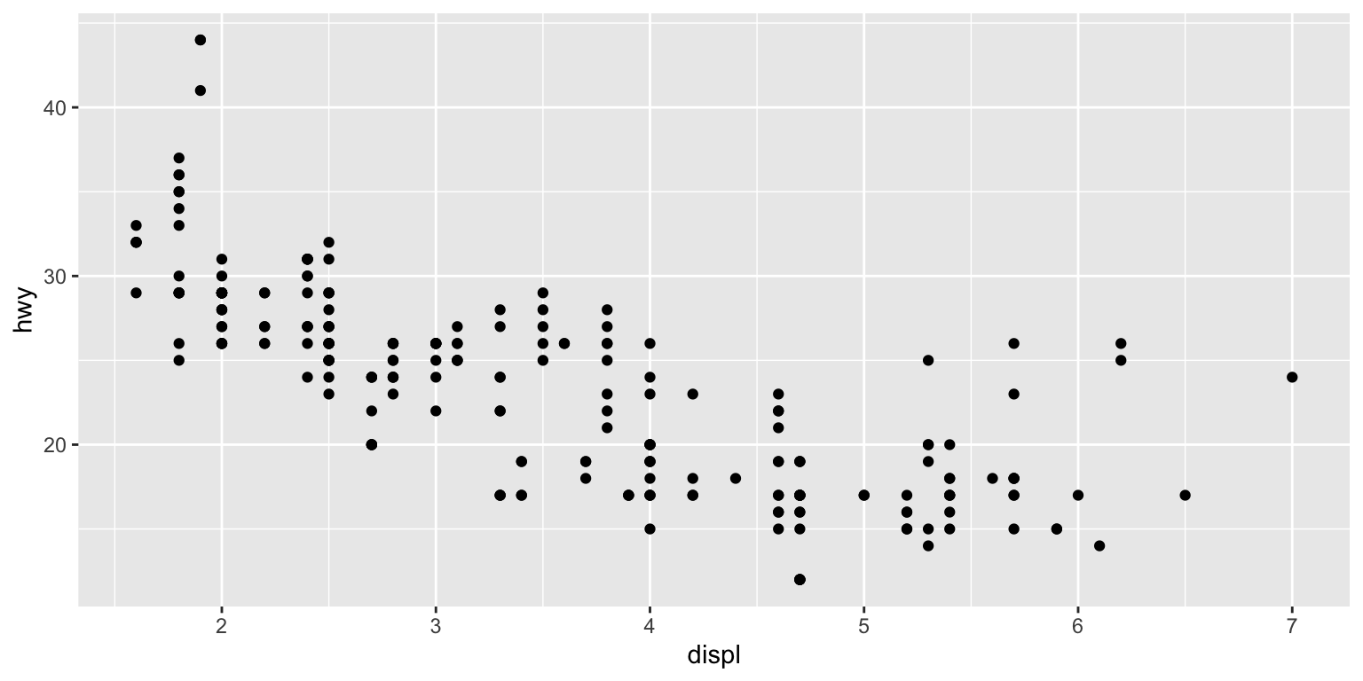
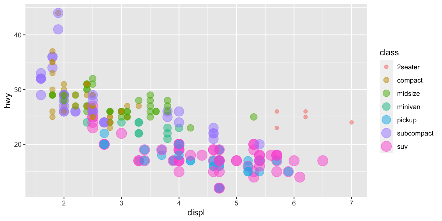
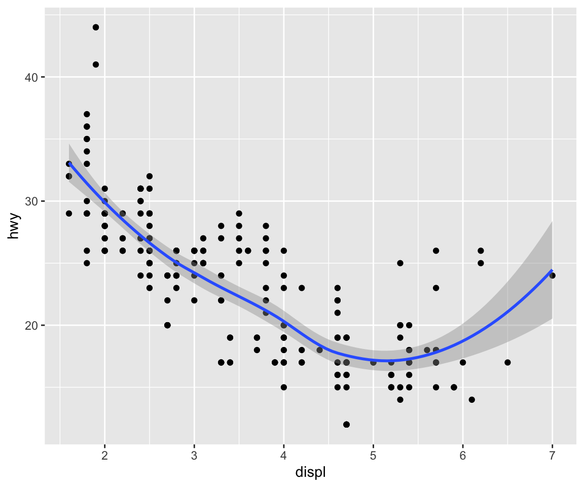
Q: Do big engines use more fuel?
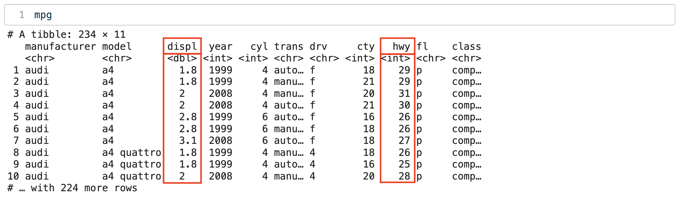
displ: engine size, in litreshwy: fuel efficiency (highway), in miles per gallon (mpg)
Creating a ggplot
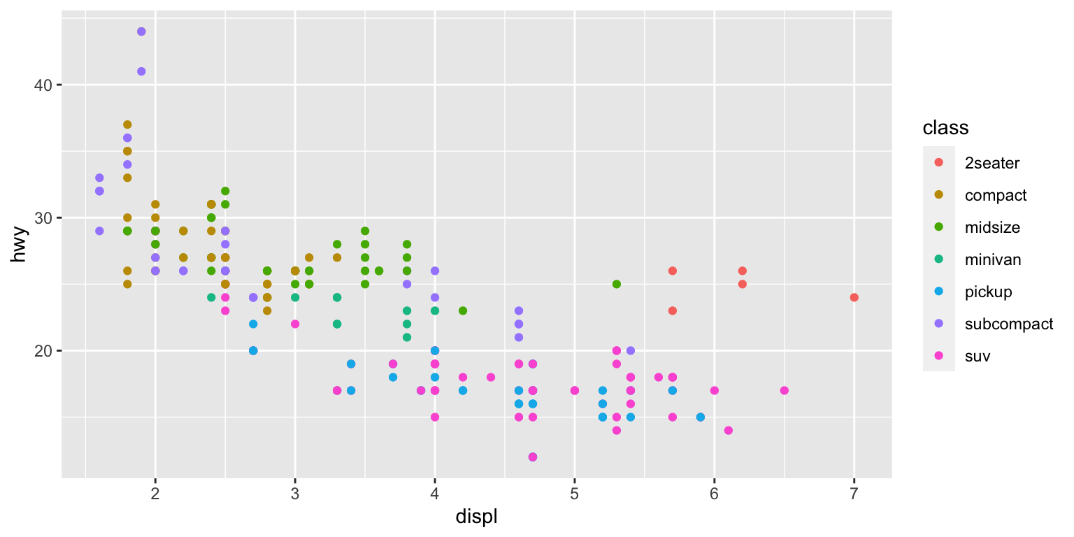
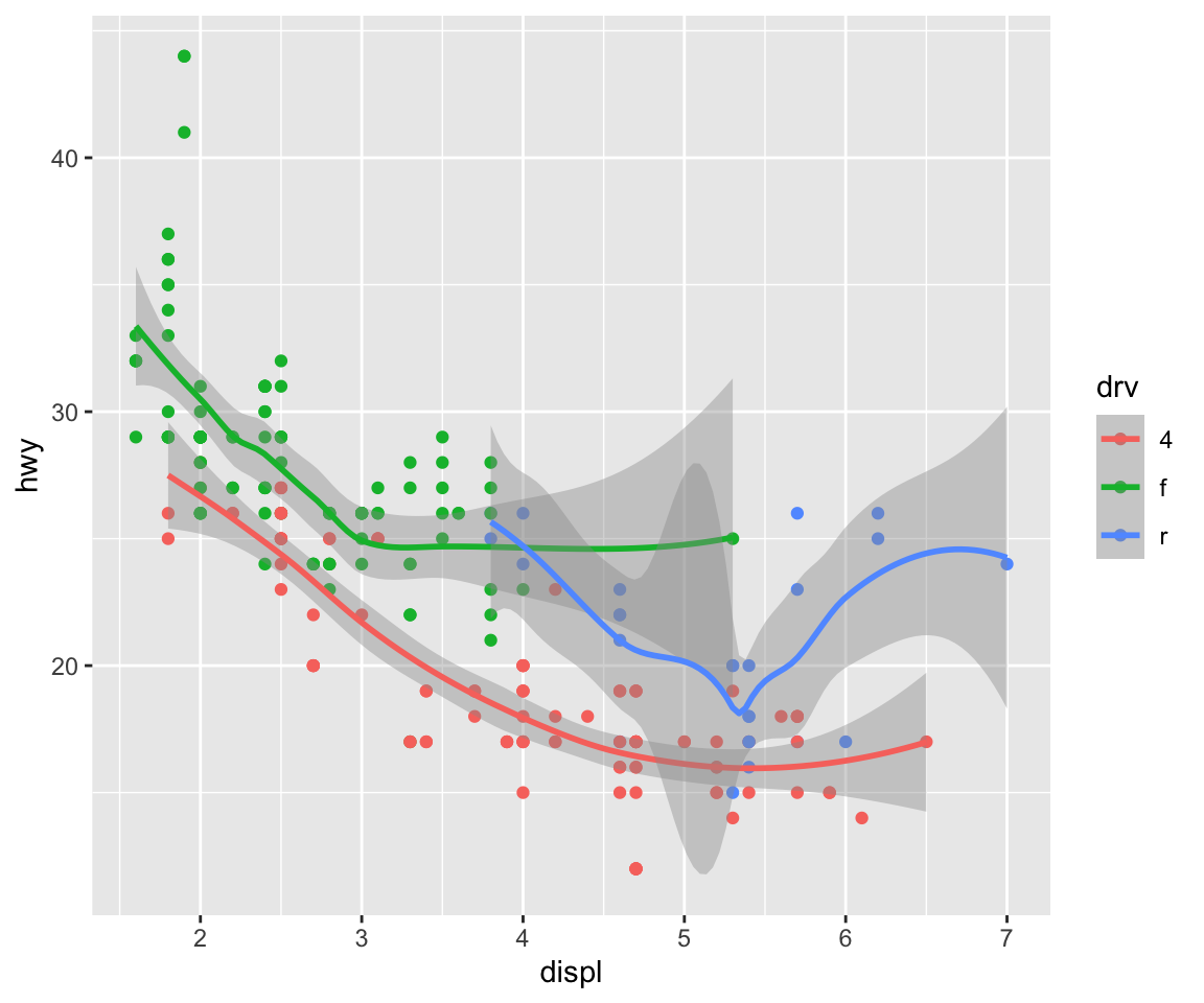
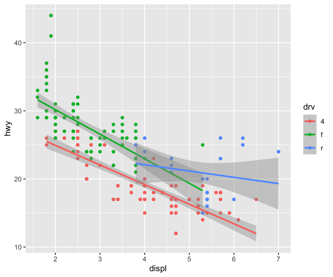
Colour-code by another variable
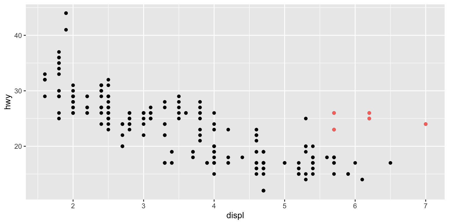
- can we explain why the cars shown in red don’t follow the trend?
Colour-code by another variable
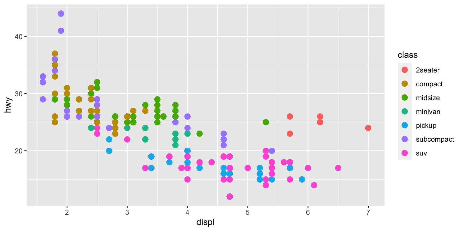
Bigger marker size
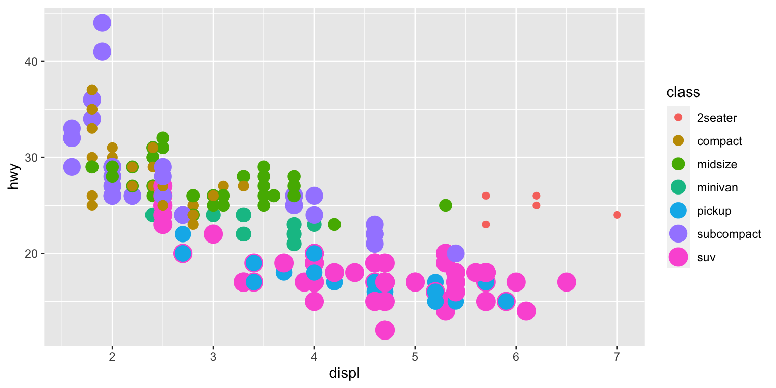
Size-code by another variable
Alpha transparency
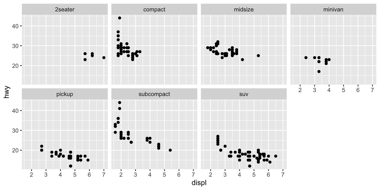
Facets—wrap
Facets—grid
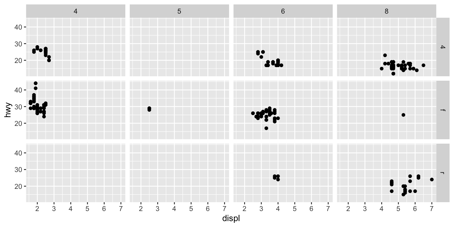
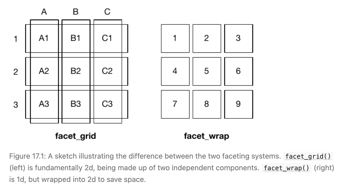
Facets: wrap vs grid
geoms—geom_point()
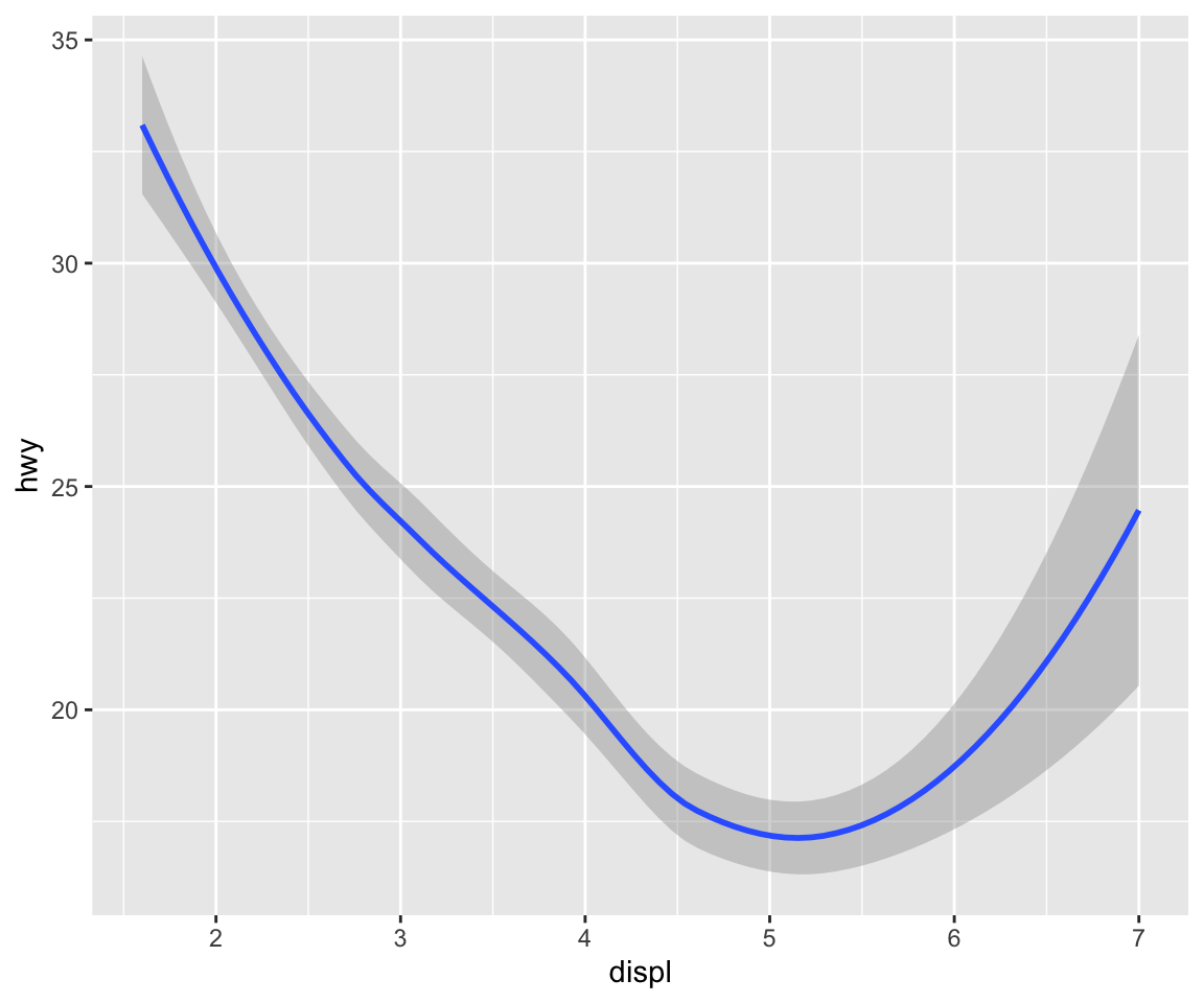
geoms—geom_smooth()
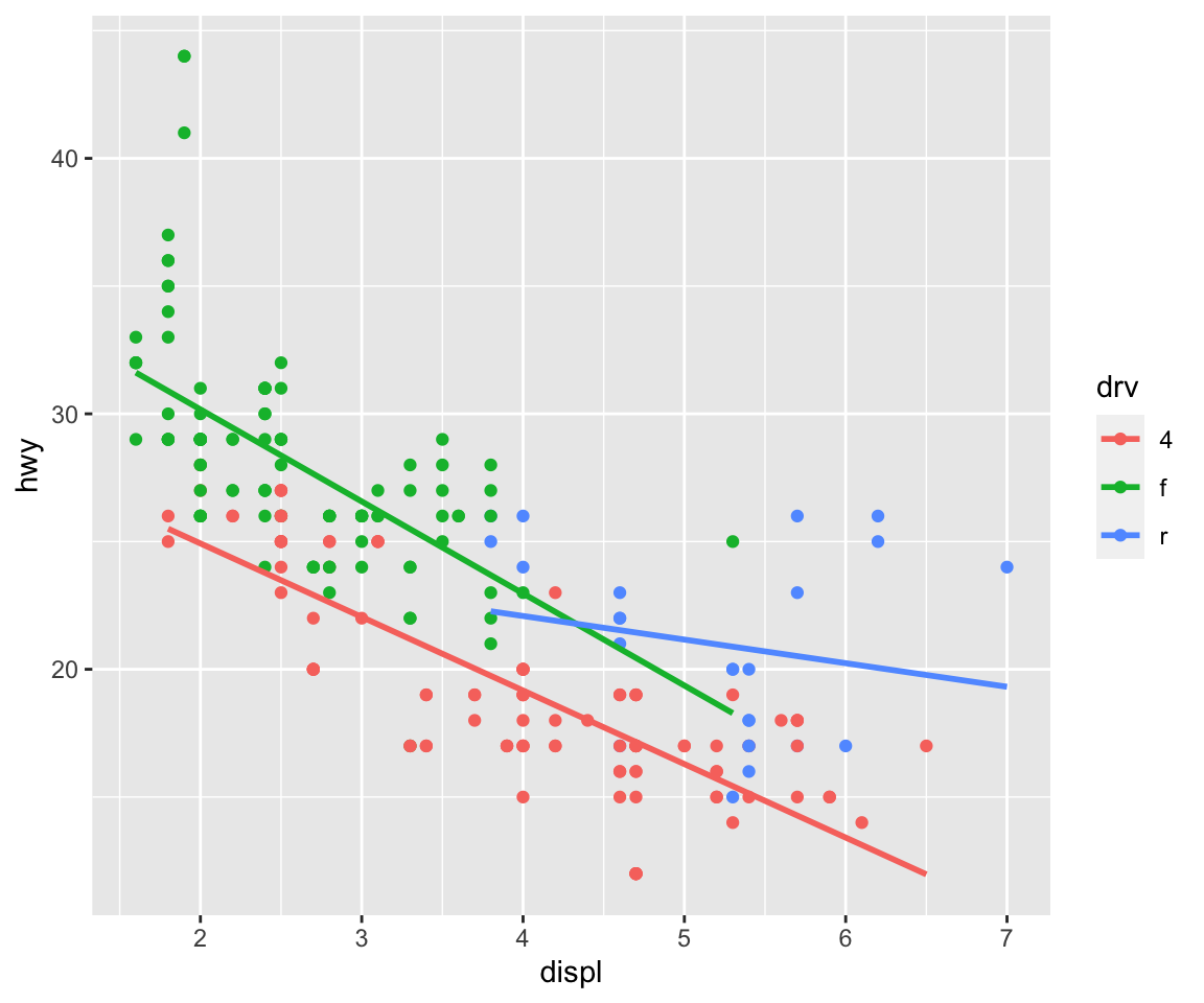
geoms–both
Pair mappings to ggplot()

geoms—colors
geom_smooth() options
geom_smooth() options
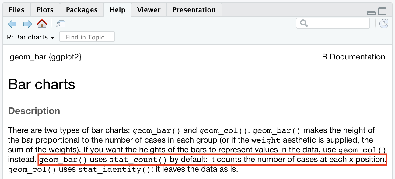
Statistical Transformations
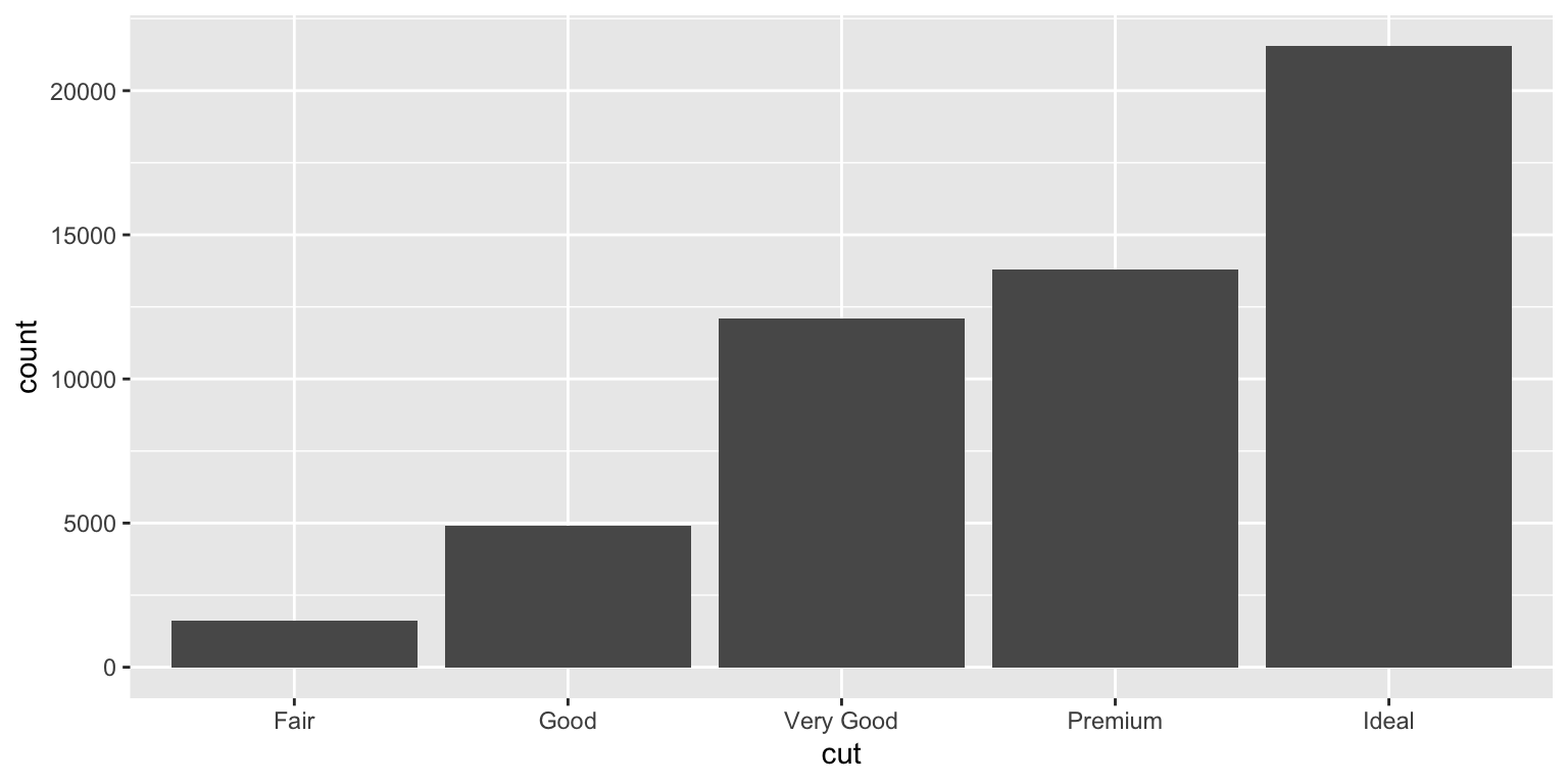
Statistical Transformations
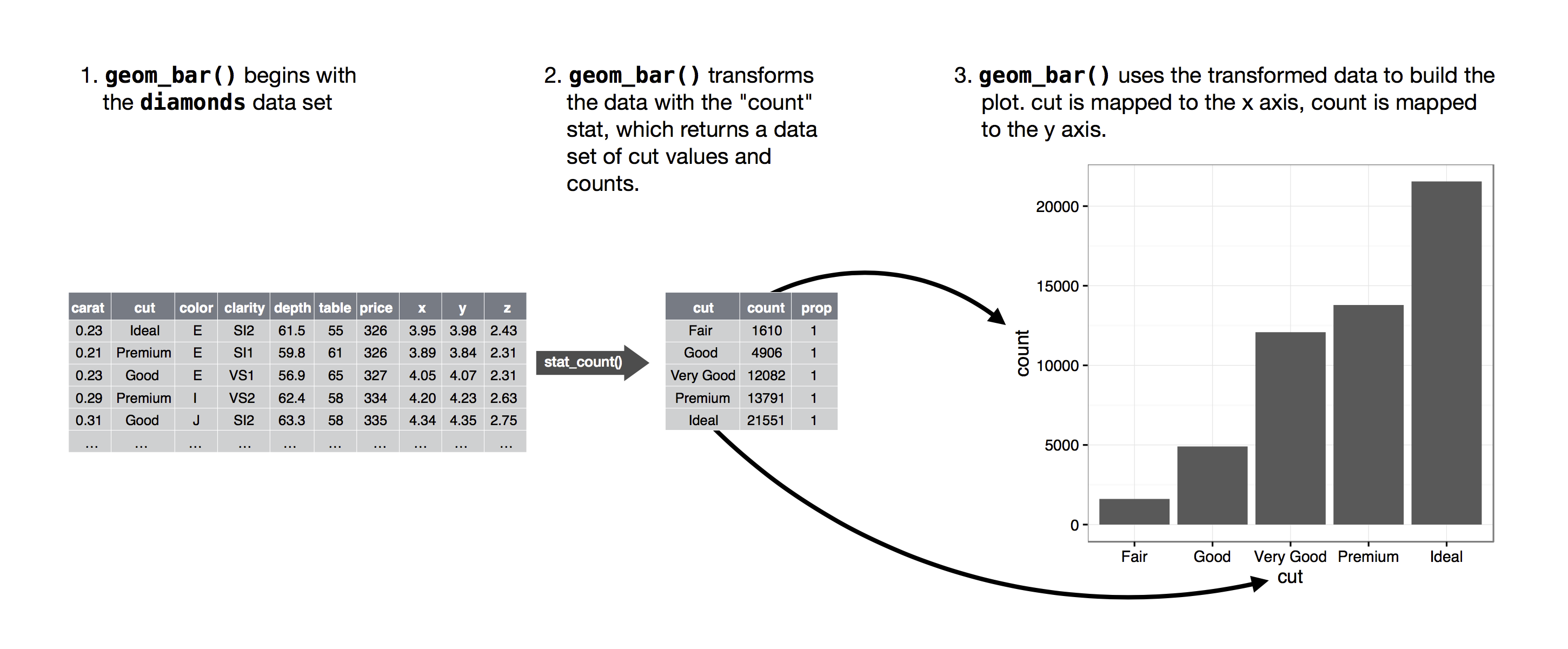
Statistical Transformations
Barplot with raw values not stat
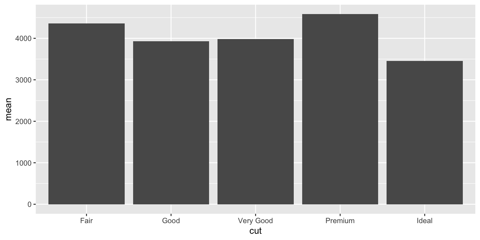
Barplot with summary (e.g. mean)

R for Data Science
- work through Chapter 3 Data visualisation
- read Chapter 4 Workflow: basics
- next week:
- Chapter 5 Data transformation
- Chapter 6 Workflow: scripts
- Chapter 7 Exploratory Data Analysis
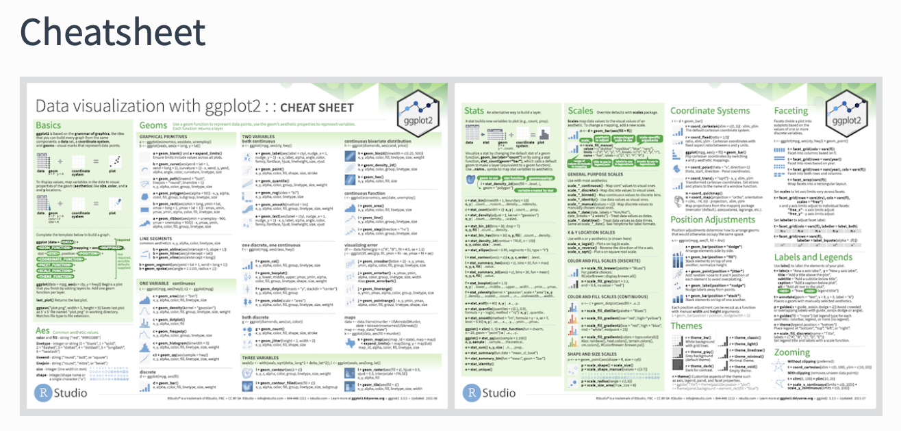
ggplot—play around!
ggplotis simple to get started with- is as complex as you want it to be
- designed as a “grammar” of graphics—systematic
- many ways of doing the same thing

ggplot—play around!
ALWAYS PLOT YOUR DATA