
Fall, 2021
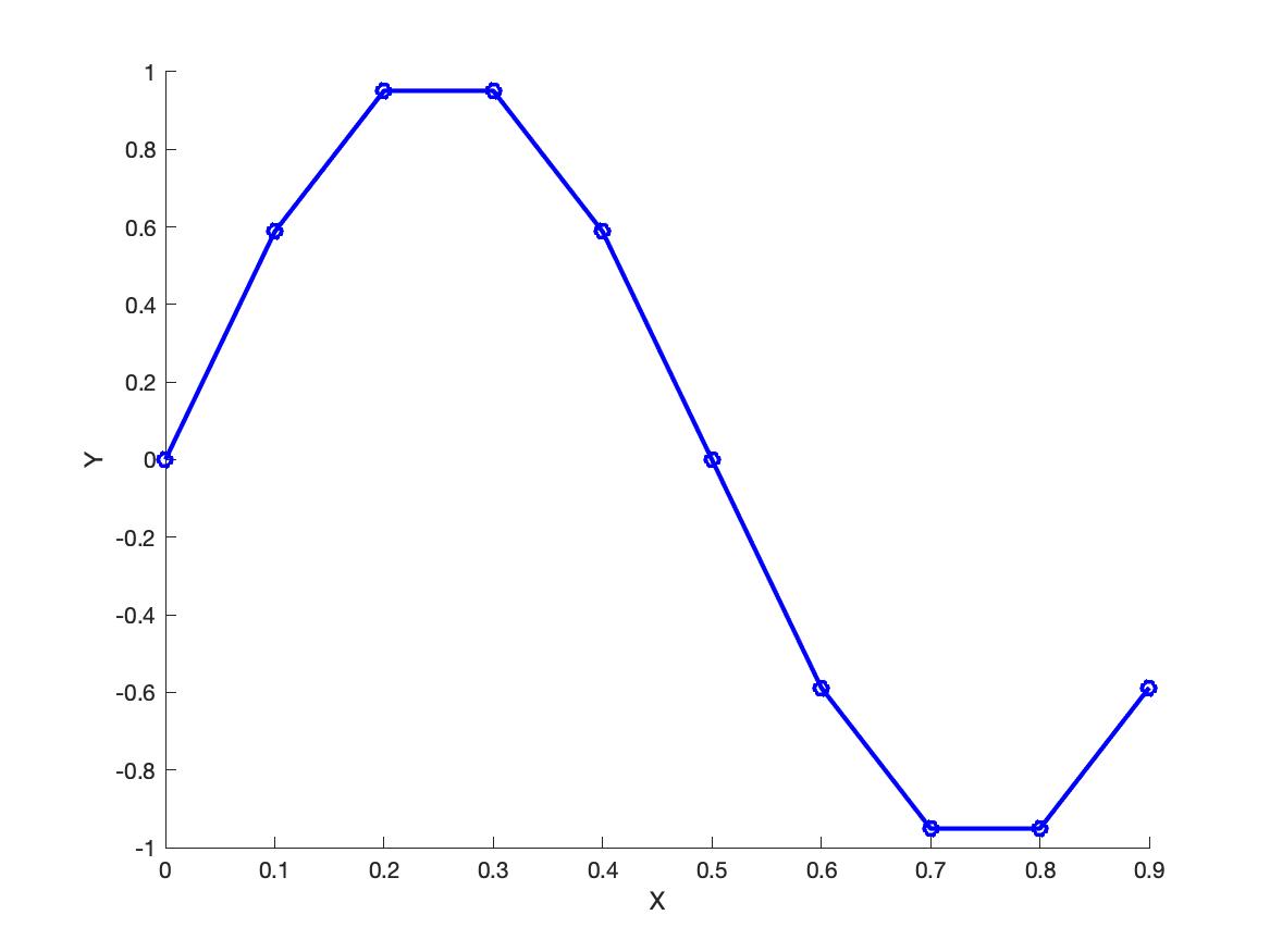
Define a vector x containing 10 values starting at 0, ending at 0.9, in increments of 0.1. Define a vector y that is equal to \(\sin(2*\pi*x)\).
Generate a line plot with x on the horizontal axis and y on the vertical axis. Generate a plot using blue circles at each data point, connected by blue solid lines, with a line width of 2.0. Label the horizontal axis “X” and the vertical axis “Y”.
Hint: the colour is pure blue, i.e. 'b' or in RBG format, [0 0 1].
Define a vector x as [1,2,3,4,5]. Define a vector y1 as [1,2,3,4,4], y2 as [1,5,6,8,10] and y3 as [5,4,2,1,1].
Generate a multi-line plot using open circles connected with solid lines. Label the horizontal axis “X” and the vertical axis “Values”. Add a legend to the plot with labels “y1”, “y2”, and “y3”.
Hint: the colours are the first three MATLAB default colours. See the help documentation for the plot() command. If you simply plot one after the other without specifying a colour, you will get these three colours, at least in the current version of MATLAB.

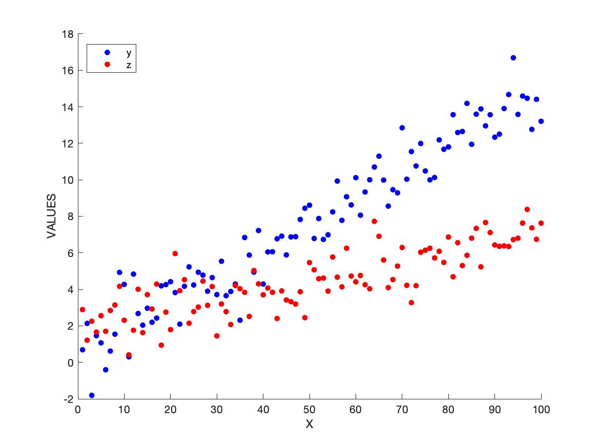
Define x as a vector starting at 1 and ending at 100 in increments of 1. Define y as a vector equal to \((x * 0.15) + N\) where N is a vector of random values chosen from a gaussian distribution with mean 0 and standard deviation 1. Let z be equal to \(((x * 0.05) + 2) + N_2\) where \(N_2\) is a vector of random values chosen from a gaussian distribution with mean 0 and standard deviation 1.5.
Generate a scatterplot of x vs y and x vs z, and include a legend. Label the horizontal and vertical axes as shown and include a legend as shown.
Hint: the colours are 'b' and 'r'. The markersize is 12.
Replot the data from question 3 using subplots, as shown below. Be sure to use the indicated axis limits on all three subplots.

Regenerate the plot from question 3 and add regression lines to each dataset. Note there are many ways in MATLAB to fit a line to data, including the fit() function, or the polyfit() function, or even by doing the matrix algebra manually. There is also a GUI-based curve fitting tool called cftool. Use whatever method you wish. Add a legend and include the equations of the lines of best fit.

Define x and y over a grid [-8,8] in steps of 0.5. Hint: use the meshgrid() function. If you’ve done it right, x and y should each be matrices with 33 rows and 33 columns. Define r equal to \(\sqrt{(x^2 + y^2)} + 0.00001\). Define z as \(\sin(r)/r\). If you’ve done it right, z should have the same dimensions as x and y (i.e. 33 rows by 33 columns).
Generate a surface plot of x vs y vs z that looks like that shown below. Hints: the command view(2) will show a 2D top-down view of a surface plot. Hint: the plotting options 'edgecolor','none' will get rid of the black lines between facets.
